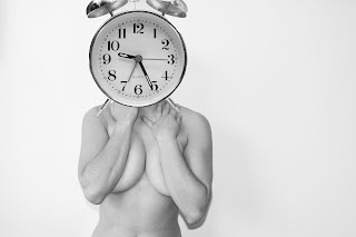
Original Proposal that i wrote:"As a final piece, i aim to produce pictures that challenge the norms of society and play on the idea that women have become puppets and dress up dolls in a media ruled society, but also how women are presented to men.Therefore through my project I aim to explore the idea of sexual fetishism-the use of women in selling men’s products but also the concept of ‘the male gaze’ and the idea of how women gain and learn to be ‘feminine’ "
Before i summarise all my work, this was something i had to do before for my pilot. Originally i believed that i had fulfilled what i had said i would do in my proposal. However my feedback was that my proprosal was interesting but i had confused myself in what i was doing and my photograps had not expressed that. However i believe that threw more research, experimentation i have achieved what i said i would do in proposal. -need to quote something from proposal and show and link it back to what i have done now!
Subject search:
Since I had started doing photography, photgraphing people has always fascinated me. But what I find interesting is going against the norms of society and challenging what we normally see in the media. When first coming up with my idea I decided to look at advertising products and got on to the subject of women and advertising and how they look and are made to look. Within this I came across sex appeal, women as objectsa, products of the gaze-providing me with plenty of theoretical research to do, media research and lots og photographers that exploe this. Advertisements that i looked at that sent me on my way to plenty of research:
Picture inserts
These advertisements were the basis of my subject research which then led me on to my media research, artists and photographers research and theoretical research:
Media research:
Within media research this was simply looking up news articles, and events to do with women as objects and how they are used as sex appeal. At the start of my research i already had decided i wanted to go against the norms of how women are normally viewed in advertising-which from my subject research-womens bodies are used to sell products-usually they are half naked-sexual facial expression
articles to do with my subject that particualry helped me develop my ideas:describe and relate
http://www.media-awareness.ca/english/issues/stereotyping/women_and_girls/upload/article_sexualized_images.pdf
http://www.dailymail.co.uk/news/article-437343/The-little-girls-sexualised-age-five.html
http://articles.cnn.com/2009-02-19/health/women.bikinis.objects_1_bikini-strip-clubs-sexism?_s=PM:HEALTH
http://www.dailymail.co.uk/tvshowbiz/article-2125921/Jennifer-Love-Hewitt-seen-natural-AND-digitally-reduced-bosom-differing-ads-The-Client-List.html
http://www.dailymail.co.uk/tvshowbiz/article-2126399/Lily-Cole-wipes-make-thought-provoking-film.html
Theoretical Research
Power of the gaze:
panopticon:
all articles you looked at-scholarly not daily mail.
To summarise, throughout my theoretical research I explored many theorists as mentioned earlier, Foucault and the gaze, Laura Mulvey and the male gaze, Freud and his concept of sexual fetishism- all of which have helped me identify what I really wanted to base my pictures around. Although I have experimented with lots of ways of how to portray my topic i believe my theoretical and practical research has aided me to fulfill what i intended to do in my proprosal at the beginning of the year.
Through looking at men’s adverts, fetishism photography and product photography I saw that all the women were thin; all had perfect skin and were modelling in an erotic confident way. To summarise, all the women in these advertising pictures looked as society, the media and men believe they should look.
These theories I have explored have enabled me
to experiment through my photographs. They have helped me both challenge the
topic and come up with original ways of making a statement. Through my
photographs I have explored the idea that we as members of society are
mannequins that the media dress up and play with while also exploring young
girls wanting to be grownup and knowing how to pose.
Artists and photogrsphers:
all these photgraphers i have done an indpemedent blog for each, this is just summarising the main influence surrounding the most important photographer. I obviously researched lots of photographers.
John Heartfield: Particularly influential as it helped me come up with my final ideas about montage and collage in photography. He was if not the most influential in helping me with the unsexed object series. His work ticked all the right boxes that i proposed for my own work-wanting to go against the norm, doing something original yet simplistic. He made a point through his photography and made people look and stop-his work about hitler was an alternative to what people were seeing in the media at the time. My own photography-is an alternative to what people at the moment see and how they see women in advertising.
Linder sterling: Also extremly influntial in manipultation, collaage, montage idea behind my final series of photographs. Her work furthermore is actually on a similar topic to mine that is to look at women in the media and how they are portrayed. Furthermore the photograph below (forks and spoons) was the initial photograph that triggered the idea of house hold objects and can any object be sold if it is put togwether with sex appeal?
Yurie Nagishima: Very useful in promting the idea of unsexed objects although not going along the same topic-helped develop my ideas hugely.
Nigel Tomm:His photos offer an angle of how to look at womens bodies and how we are bombarded with magazine pictures of naked women in sexual positions.
aided me in developing my intital ideas and producing images of magazine cut outs and the perfect face-although not my final images they were step in the right developing direction.
Spoof Ads also very influetial: insert some pictures


